Working with Elements
What is an Element?
In IconVectors, an element is any individual object that appears on the canvas. Elements are the building blocks of your icon and can take various forms — from simple shapes to complex custom paths.
Each element can be:
A geometric primitive such as a rectangle, ellipse, line, or polygon
A path, made of anchor points and Bézier curves
A group, which contains other elements
A symbol or badge overlay
All elements share a common structure: they have fill and stroke properties, can be transformed (moved, scaled, rotated), and can be arranged in layers.
You can view and manage all elements of your icon in the Layers Panel, where each item corresponds to one element or group of elements.
Hint
While geometric primitives are easy to draw and edit with their built-in handles, they must be converted to paths if you want to edit their structure point by point.
Selecting Elements
Before applying any transformation, color, or effect, you must first select the element(s) you want to edit. IconVectors offers two main methods for selecting elements:
Selecting in the Layers Panel
The Layers Panel is located on the right side of the workspace. It displays a hierarchical list of all elements and groups in the current icon.
Click on an element’s name or thumbnail to select it
Hold Shift or Ctrl and click additional items to select multiple elements
This method offers precise control over selection, especially when working with overlapping or small elements.
Selecting on the Canvas
You can also select elements visually using the Selection Tool on the canvas:
Click directly on the border of an element
Hold Shift and click to add or remove elements from the selection
Drag a selection box to select multiple elements at once
See also
For more on using the Selection Tool, see The Selection Tool
Creating Geometric Elements
You can create basic geometric elements such as rectangles, ellipses, lines, and polylines directly in the workspace.
Available Shapes
Rectangle Tool
Ellipse Tool
Line Tool
These tools are available in the left toolbar and allow quick creation of shapes by clicking and dragging on the canvas.
Pen Tool Used to create polylines by clicking to define each point. For more details, see The Pen Tool.
Shape Creation Options
Shift: Hold Shift while drawing to constrain the shape:
For rectangles: forces a square
For ellipses: forces a circle
Alt: Hold Alt while drawing to create the shape from the center. You can also combine Shift + Alt to draw a square or circle from the center.
Element Type (Geometric vs Path)
Rectangles, circles, and lines can be created either as:
Geometric native elements (e.g., <rect>, <circle>, <line>), or
Path elements (e.g., <path> equivalent of the shape)
This behavior depends on the option set in the Preferences dialog under the Editor tab.
Hint
Native geometric elements are lighter and easier to manipulate as shapes. However, for advanced editing (e.g., bezier curves), you can convert them into editable paths.
Converting to Path
To modify the shape of a geometric element using curve editing tools, convert it to a path:
– Ctrl+B
This operation transforms the geometric element into a path, enabling full point-level editing.
Organizing Elements
The organization and hierarchy of elements in your document determine how they are visually layered and structured. Axialis VectorIcons provides several tools to manage this structure both in the workspace and through the Layer List panel.
Visual Stacking Order
Elements are rendered in the order they appear in the document hierarchy:
Items at the top of the Layer List are visually on top (foreground).
Items lower in the list appear behind (background).
You can use this order to control which elements appear in front of or behind others.
Working with the Layer List
The Layer List panel allows you to:
Reorder elements using drag and drop.
Toggle visibility of individual elements using the eye icon.
Group or ungroup multiple elements (see below).
See the hierarchical structure of groups and sub-elements at a glance.
Grouping and Ungrouping
You can combine multiple elements into a group to organize your document and apply transformations or styles collectively.
– Ctrl+G to group selected elements.
– Ctrl+Shift+G to dissolve a group into its individual elements.
These commands are available in the Element menu and in the context menu (right-click) within the workspace or Layer List.
Changing the Drawing Order
To adjust the stacking position of elements:
Use drag and drop in the Layer List, or
Use the commands in the Element menu:
– Ctrl+Home
– Ctrl+Up
– Ctrl+Down
– Ctrl+End
These commands shift the selected element(s) higher or lower in the visual hierarchy.
Tip
You can also use the keyboard shortcuts above to quickly organize selected elements without switching panels.
Fill and Stroke Properties
Every element in IconVectors has two primary visual properties that define how it is rendered: Fill and Stroke.
Fill
The fill is the color (or gradient) used to paint the inside of a shape or path.
Applies to closed shapes (like rectangles, ellipses, and closed paths)
Can be a solid color, a transparent color, or a gradient
If no fill is defined, the inside of the shape remains transparent
Stroke
The stroke is the outline drawn around the edge of an element.
Can be applied to both open and closed paths
You can control:
Color: Any solid color or transparency
Width: Thickness of the outline in pixels
Style: Solid, dashed, or dotted
Line caps: How open path ends are drawn (flat, round, square)
Joins: How corners are rendered (miter, round, bevel)
Even open shapes (like lines or polylines) can have strokes
Using Fill and Stroke Together
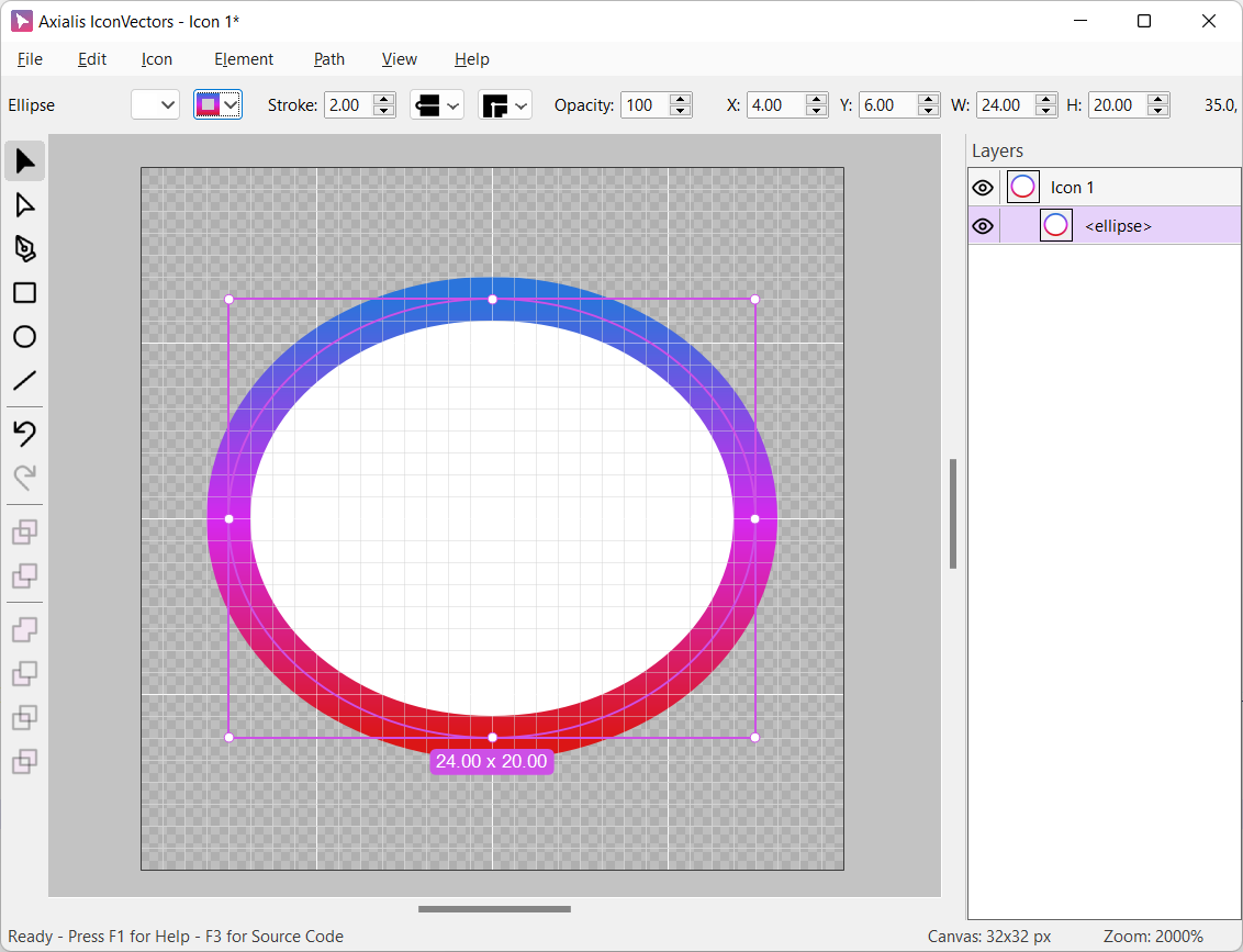
You can use fill and stroke simultaneously to create visually rich icons. For example, an ellipse may have a white fill and a blue 2px stroke:


Hint
In SVG terms, these properties correspond to the fill and stroke attributes of the element. You can edit them visually in IconVectors using the Control Bar.
Applying Colors
In IconVectors, every element can have both a fill color (interior) and a stroke color (outline). To change these colors, use the Control Bar, located at the top of the workspace.
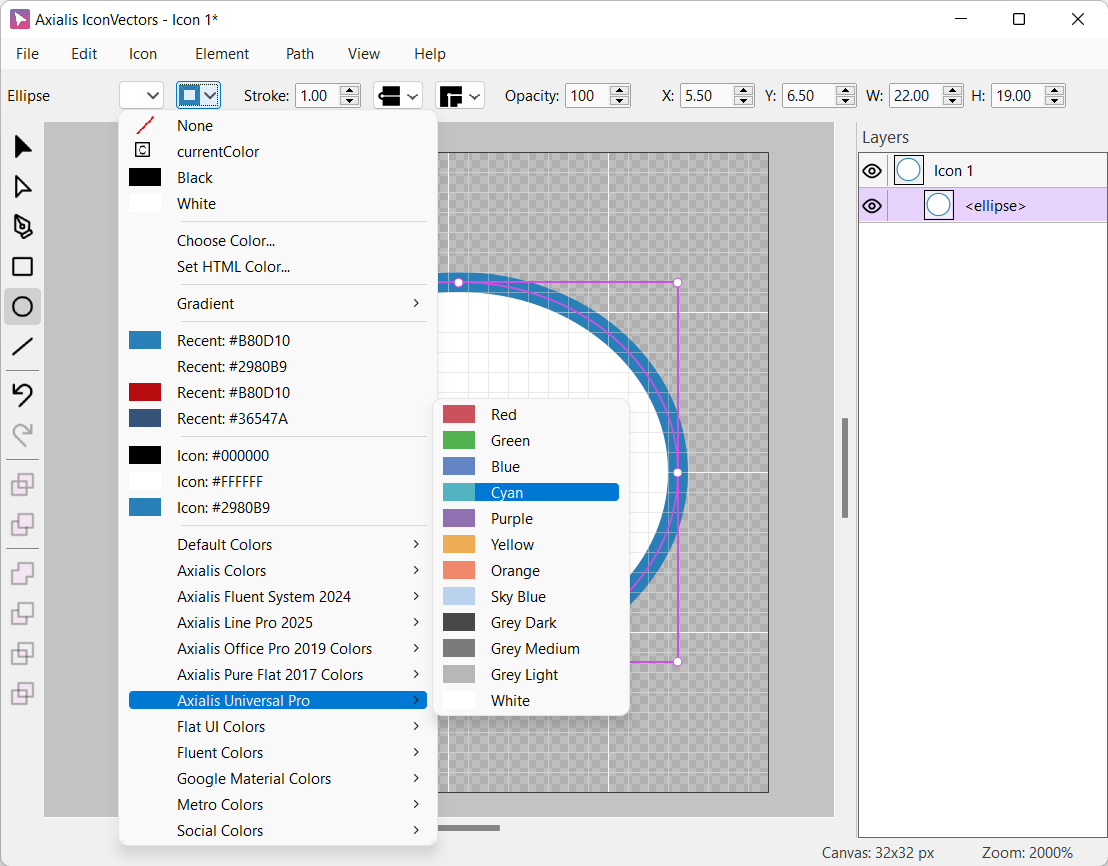
Choosing Fill or Stroke
Before applying a color, you must first specify which property you want to change:
Click the Fill or Stroke color button in the Control Bar
A drop-down menu appears below the button
This menu lets you pick a color in several ways.
Standard and Recent Colors
In the drop-down menu, you can:
Choose from your recently used colors
Choose from colors already used in the icon
Predefined Palettes
IconVectors comes with curated color palettes designed by Axialis to match professional icon design themes. These include:
Flat UI palette
Material Design palette
Axialis palettes
You can switch between palettes using the drop-down selector inside the color menu.
Using the Color Picker Dialog
If you need precise control, click “Choose Color…” to open the Choose Color Dialog.
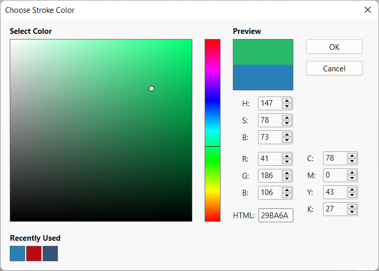
This dialog supports:
Direct click in color areas: brightness/saturation or Hue.
RGB, HSV, CMYK, and HTML inputs
Industry-standard color sliders
Recent color swatches
Hint
The Axialis color dialog is using the industry standard interface, so you can easily use it. If you want to use the standard dialog of the operating system, this can be set in Preferences.
Applying Gradients
Understanding Gradients
Gradients in SVG allow you to create smooth color transitions across fills and strokes. They can significantly enhance the visual depth and appeal of icons by blending multiple colors seamlessly.
SVG supports two primary types of gradients:
- Linear Gradient
A transition of colors along a straight line. You can control the direction using an angle.
The angle is measured in degrees.
An angle of 0° creates a horizontal gradient (left to right).
An angle of 90° creates a vertical gradient (top to bottom).
You can use any value between 0° and 360°.
- Radial Gradient
A color transition that radiates outward from a central point.
Colors transition from the center (start color) to the edges (end color).
The shape is usually circular but can be elliptical depending on the object.
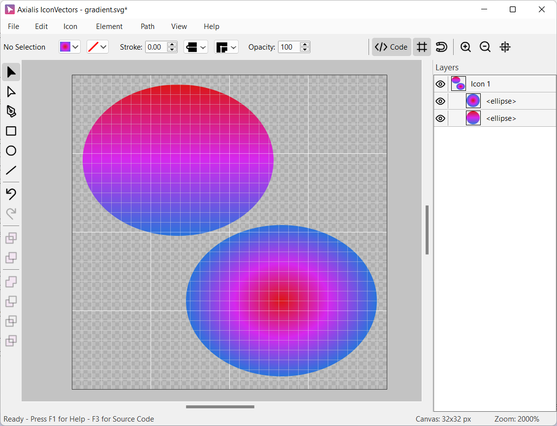
See the differences between Linear (upper-left ellipse) and Radial gradients (bottom-right ellipse):
A gradient is defined by a series of color stops:
- Color Stops
These are control points along the gradient where a specific color is applied.
SVG interpolates the color between the stops.
You can have as many stops as needed to create complex transitions.
Each stop has a position (0% to 100%) and a color.
- Stop Position
Indicates where along the gradient the stop is placed.
Positions are either defined in percentage or as a unit distance.
- Stop Color
Defines the actual color at that point in the gradient.
You can use solid colors or colors with alpha transparency.
For linear gradients, the direction of the gradient is controlled by the angle:
An angle of 0° runs from left to right.
90° runs from top to bottom.
180° is right to left.
270° is bottom to top.
Radial gradients do not use angles but rather expand from a central origin, which may be adjusted in some SVG implementations.
The Gradient Editor
If you select Set Gradient, the gradient editor dialog opens:
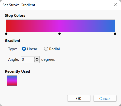
The Set Gradient dialog lets you design your own gradient with the following options:
- Stop Colors
The gradient preview shows the color stops as black dots.
Add a stop: Click anywhere in the gradient preview area.
Remove a stop: Drag a black dot downwards out of the bar.
Move a stop: Click and drag the black dot left or right.
Edit a stop: Double-click the black dot to select a new color.
- Gradient Type
Linear: A straight-line gradient in the specified angle.
Radial: A circular gradient from center to edges.
- Angle
For linear gradients, specify the angle (in degrees) of the direction.
- Recently Used
Previously applied gradients are shown at the bottom of the dialog for quick re-use.
Hint
Gradients can be applied to either fill or stroke. Be sure to choose the right dropdown control before opening the gradient options.
When done, the element received the new gradient, for example the stroke gradient:
Applying Transformations to Elements
This topic explains how to apply geometric transformations — Move, Scale, Rotate, Reflect, and Matrix — to one or more selected elements in the workspace. These transformations are applied directly to the geometry of the elements rather than using SVG transform attributes.
Hint
If the selection includes geometric elements such as rectangles, circles, or lines, they are automatically converted to paths before applying the transformation.
Transform Commands
Each transformation opens a dialog box where you can enter specific parameters:
– Ctrl+M Shift elements horizontally and/or vertically by a specified offset.
– Ctrl+E Scale elements by defining scale factors along the X and Y axes. An option allows you to lock the aspect ratio.
– Ctrl+T Rotate elements around a center point by a specified angle (in degrees).
– Ctrl+F Reflect elements across a horizontal, vertical, or custom axis.
Apply a custom affine transformation using a 2×3 matrix. This offers full control over scaling, rotation, skewing, and translation.
Important Notes
All transformations are applied destructively to the shape data.
SVG
transformattributes are not used (see next topic).When multiple elements are selected, transformations are applied relative to a common reference point (e.g., center or origin).
An Undo command is available to reverse the operation if needed.
SVG Transformations
In SVG, a transformation is a mathematical operation that changes how an element is rendered on the canvas — without altering its underlying geometry. Transformations can be used to:
Translate (move) an element
Scale (resize) it
Rotate around a point
Skew in horizontal or vertical directions
These are defined using the transform attribute in SVG, which may look like:
<rect x="0" y="0" width="20" height="20" transform="rotate(45)" />
This rotates the rectangle by 45°, but the original shape remains unchanged.
How IconVectors Handles Transformations
When loading SVG documents, IconVectors detects and applies all transformations to the actual geometry of the elements, rather than preserving the original transform attributes.
This means:
Transformed shapes are baked into their new positions, sizes, or orientations
The Source Code Viewer does not show transform=”…” attributes — transformations are already applied
This approach ensures better compatibility with UI frameworks that don’t fully support or properly apply SVG transformations
Why This Matters
Many application frameworks (especially those used in desktop or mobile UI development) ignore or misinterpret complex transforms in SVGs. By applying transforms during import, IconVectors guarantees consistent rendering across platforms.
Note
If you’re importing icons from other tools (like Figma or Illustrator), and they contain transforms, IconVectors will apply them during load — the visible result remains identical, but the internal representation is simplified.